Methodologies for measuring project health
July 18, 2018
A lot of people are interested in measuring the health and velocity of open source projects. After digging through the current research landscape, I’d like to summarize the most common approaches I’ve seen, and my conclusions here.
My view is that we focus too much on contributors, rather than project activity, and that contributors are an inadequate health measure for the increasing number of smaller, but critical, open source projects today.
[Note: For consistency, all project examples referenced in this post come from the papers themselves and are based on when the data was collected, which may no longer be true today]
First approach: Ability to attract and retain contributors
I’ll start with a question: How do we know whether an open source project is doing well? What would be the key indicators?
A reasonable first guess would be looking at how many people contribute to the project. After all, if nobody contributed to an open source project, the project would die.
Metaphors are rife when it comes to open source, and while researching this topic, I noticed a number of papers comparing open source to biology, where projects are like ecosystems. Imagine that a surviving ecosystem is one where speciation (creation of new species) outpaces extinction (death of existing species). Conversely, a declining ecosystem is one where extinction outpaces speciation.
Let’s start with this as our rudimentary model, where ideally, a healthy project is one where more contributors are coming in vs. leaving. I liked Christopher Baker’s image of a fountain [1] as a way of visualizing this approach.
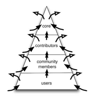 Image from “Modeling open source software communities” [1]
In this image, for each role in a project (core developers, contributors, etc), there are always people “spilling” out of the community (visualized by the white-tipped arrows), but in a healthy project, more contributors always come in to replenish them (visualized by the black-tipped arrows).
Baker applies his thesis to two projects, Pidgin and Django. In his analysis, Pidgin is an example of an unhealthy project, because they’re losing more people than they’re gaining over time. Django is an example of a healthy project, because they have many core developers and are consistently growing their community.
Felipe Ortega and Daniel Izquierdo-Cortazar extended this approach by using survival analysis methodology to predict the expected lifetime of contributors in a community. The core assumption is the same: if the project loses contributors faster than it gains them, “it will unavoidably die due to the lack of contributions”.
Second approach: Rates of attraction and retention
The approach above suggests that projects gain and lose contributors at some fixed rate. However, we know this isn’t the case. Some projects are better at attracting and retaining contributors than others. How might varying rates change our health model?
Kazuhiro Yamashita et al took this approach, looking not just at a project’s ability to attract new contributors, but also their ability to retain existing contributors, using the following variables:
- Magnet: Projects that attract a large proportion of new contributors, calculated as the proportion of first-time contributors in a given time period
- Sticky: Projects where a large proportion of the contributors keep making contributions, calculated as the proportion of contributors who make additional contributions in the following time period
The terms “magnet” and “sticky” come from Pew research on population migration trends. Using these two variables, Yamashita et al come up with a quadrant plot for classifying healthy vs. unhealthy projects:
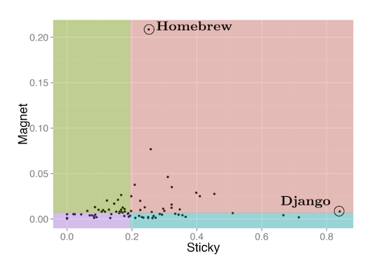 Image from “Magnet or Sticky? An OSS Project Typology”
Here’s what the quadrants mean:
- Attractive (red): Highly magnetic and sticky
- Stagnant (blue): Highly sticky, weakly magnetic
- Fluctuating (green): Highly magnetic, weakly sticky
- Terminal (purple): Weakly magnetic and sticky
Yamashita’s approach gives us a slightly richer understanding of what a healthy project might look like. While a healthy project would ideally be both magnetic and sticky, there are alternative stable possibilities where a project is either more sticky or more magnetic.
Maybe not many contributors join the project, but those who stay are in it for the long haul. Or maybe there’s a revolving door of new contributors (as one might imagine in Baker’s fountain model), but never a shortage of fresh talent. However, if a project can neither attract nor retain new contributors (i.e. terminal state), it’s got a high chance of dying out.
But not all contributors are alike!
Our model looks a little better now. But there’s a glaring problem with both approaches: contributors are not fungible.
Not all contributors produce the same value, nor do they want the same things. Given different incentives, there’s variance in their expected quality and duration of contribution.
In a typical popular project, at least half (though I’ve seen much higher numbers) of contributors are casual, making only one contribution ever (ex. fixing a bug they came across while using the project). Although there are a lot of them, they account for less than 2% of commits. Nobody expects these contributors to stick around, and that’s okay.
On the other end of the spectrum, maintainers, who make up the bulk of commits, can mean life or death for a project. To use another conservation biology metaphor, project maintainers are like a keystone species. Although there are fewer of them, removing a member of a keystone species has a disproportionately negative effect on the ecosystem.
We can’t analyze contributors monolithically. And yet, a shocking amount of research looks at “contributors in, contributors out” as a means of measuring project health. This ignores the fact that total number of contributors does not correlate to whether a project survives.
Imagine two projects, each with 10 total contributors. The first project has 10 active, regular contributors. The second project has one maintainer and 9 who have only contributed once. Those are two very different setups, yet both could be sustainable (or not) for different reasons.
Both methodologies reviewed thus far assume that each contributor is of equal value to the next. But we know that newer contributors are likely to make lower-quality contributions, if only because they’re unfamiliar with the project. By contrast, regular contributors are likely to have their work reviewed and merged more quickly.
Much like hiring an employee, two contributors filling the same “role” could achieve vastly different outcomes based on things like: aptitude, familiarity with the codebase and language, and prior experience with one’s teammates. So we need to measure not just the number of contributors attracted or retained, but the quality of their contribution.
Saya Onoue et al tackled this challenge, iterating upon the magnet-sticky model by including these variables associated with contributors:
- Experience level: Represented by new contributors ratio (NCR). New contributors have less than three months of activity. Experienced contributors have greater than three months.
- Code contributions: Represented by coding contributors ratio (CCR). Coding contributors made at least one commit or PR in a given period. Non-coding contributors made issues or comments, but did not take these other actions. [Note: this isn’t perfect, as one could make non-code commits or PRs, but seemed to produce directionally interesting results]
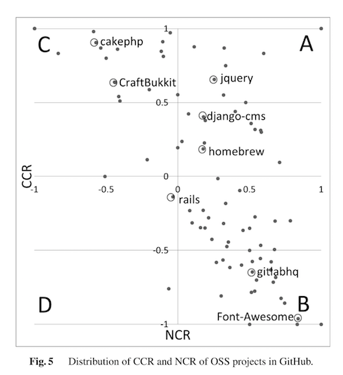 Image from
 In the image above, high CCR = more coding contributors, and a high NCR = more new contributors. So, a project like cake-php has a stable group of contributors who tend to write code. By contrast, a project like Font Awesome has a lot of new contributors making non-code contributions. (From Onoue’s analysis: “This project makes Web icon fonts, and many people sent requests for new icons to this project. Therefore, many non-coding contributors leave this project immediately following a short period of contribution.”)
Should we use contributors at all?
Differentiating contributors is helpful, but it’s still not enough. As much as I love the idea of using conservation biology to measure the sustainability of open source ecosystems, they only really apply to just that: ecosystems.
Onoue et al only looked at projects with 100+ contributors. Many open source projects - even popular, widely-used ones! - don’t fit this model. There are many smaller libraries with just a handful of total contributors to the project and only one or two active maintainers. Maintainers of smaller projects may be less concerned with how many contributors they attract and retain, and more with the regularity of commits. Not every project will ever look like Django.
If that’s the case, we’d have to find a different way of measuring the health and “endangered status” of these projects. Can we find a metric that accounts for projects of all sizes and scopes?
Imagine you’re looking for a particular library to use on GitHub. You find a few that will work. Given two similar projects, which one should you choose?
Ask a developer this question, and you’ll probably get this answer:
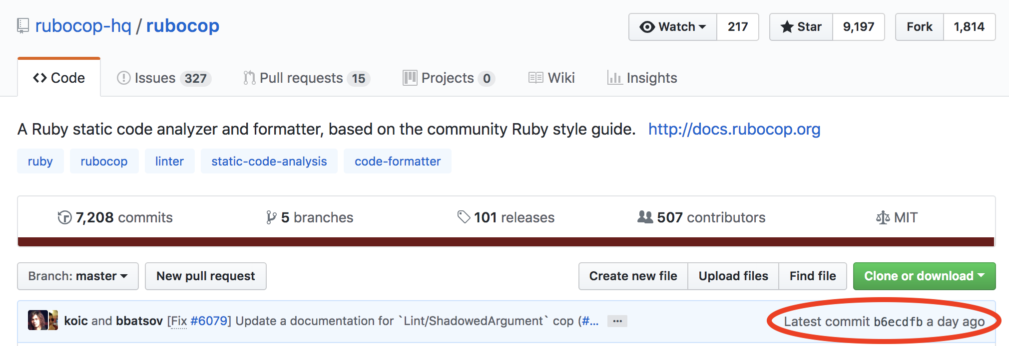
In addition to other heuristics like stars and personal recommendations from other developers, “latest commit” is a useful indicator of whether a project is being actively developed, and thus reliable to use. This is not dissimilar to looking at the date that a news article was published before deciding to cite information within.
The importance of “latest commit” suggests that perhaps we should look at “work done” as a key health metric. How you get there, with whatever your contributor makeup, varies widely depending on the size and scope of a project.
How should we track project activity? Saya Onoue et al come back with an alternate approach that uses a new metric: GPPR (Gross Product Pull Requests).
Looking at pull requests, rather than count or quality of contributors, gets more directly to the question of output. It doesn’t matter how many people contribute or how many hours were put into it, so long as pull requests are being opened and merged. It’s also a more universal health metric that can work agnostically from a project’s size.
Inspired by Hans Rosling’s talk about the “Health and Wealth of Nations”, which suggests that a country’s health is closely correlated to its wealth, Onoue et al uses GPPR to calculate the “wealth” of open source projects:
- Wealth: Gross Product Pull Requests (GPPR), defined as the number of pull requests merged in a month
- Health: A combination of 1) workrate (defined as labor) of each contributor, 2) attractiveness of new contributors to a community [i.e. magnet], 3) active retention of experienced members [i.e. sticky]
Using these definitions, they are able to describe the behavior of several projects. For example, in their analysis, d3 is a project with low but consistent activity that comes from more experienced contributors.
While there’s room for improvement, I directionally prefer using some version of commits and/or PRs merged to measure project health. As opposed to contributor count, “work done” seems to be a more resilient metric that accounts for the many shapes and sizes of modern open source projects. It also opens the conversation to a wider swath of sustainable production models, rather than assuming every project, in order to be healthy, must cater to as many contributors as possible.
Suggestions for further improvement
I’ll wrap this up by acknowledging that project “health” is a fuzzy term. PRs or commits might tell us that a project is active, but does that mean the project is healthy? What is the relationship between project health and activity?
If health means survival, while activity isn’t a perfect proxy for health, it seems closer to answering the original How do we know a project is doing well? question than any other metric I can think of.
For example, you might say that looking at commits ignores valuable non-code contributions, like comments or code review. However, the other extreme - a project with lots of comments and reviews, but no work done - seems almost definitely unhealthy.
We might also consider the relationship between activity and popularity. One could argue (at least for projects at the application layer) that popularity still depends on activity. If a project isn’t actively developed, it will decline in popularity over time. (And the reverse case: a project that’s active, but declining in popularity, might indicate a sign of “healthy decline”, much like an old-growth forest, where users are migrating to another project that better suits their needs.)
There are still benefits to considering project activity in tandem with other metrics. As in Onoue’s second model above, things like contributor makeup and non-code contributions can provide a more complete picture of what’s happening. However, when it comes to the bottom line, “work done” seems like the most important metric to track health.
A few suggestions for improvement:
- What’s the right level of granularity? For example, there might be one massive PR that takes awhile to get merged, vs. many smaller ones. Commits are more granular, but they aren’t uniform in size, either. (To be fair, GDP doesn’t necessarily account for the “meaningfulness” of a dollar spent, either, so maybe a simple metric is better for benchmarking.)
- Look at work rate, not absolute numbers: It would be interesting to look at projects with consistent, but low activity, versus projects with large bursts of inconsistent activity. Much like Yamashita’s magnet-sticky model, are there multiple states of health here?
- What about stable projects? This is my biggest concern with using an activity metric. If a project is stable and widely used, but doesn’t require much more work, it shouldn’t be penalized for low activity. To me, this is the best argument for incorporating issues, not just PRs, even if they’re weighted less. Issues can tell us whether a project is stable or stagnant. For example, a project that’s not very active, but has many open, unaddressed issues, might indicate it’s not being maintained.
Maybe “issue zero” and “pull request zero”, with a steady rate of issues/PRs being opened and closed, is the picture of project health.
What do you think? I’d love to hear it!
[1] I can’t find a public link to this dissertation, but I quite like the fountain image, so here’s the - ahem - official citation: Baker, C., Anderson, Kenneth, Martin, James, & Palen, Leysia. (2010). Modeling Open Source Software Communities, ProQuest Dissertations and Theses.
Thanks to Mike McQuaid for provoking thoughts on this topic last year.