Mapping digital worlds
April 17, 2023
I gave a talk at The Stoa in February about “Mapping digital worlds to understand our present and future.” You can watch the video here; the following is a transcript of that talk.
Peter Limberg asked me to talk about an analysis I did late last year, where I mapped out all the different tribes that are influencing the climate conversation today. But since Peter also did a great analysis of mimetic tribes back in 2018 that I enjoyed, I thought it’d be fun to zoom out and talk about this meta-practice of mapping digital worlds more broadly: both why it matters, and how I and others go about doing it.
Table of Contents
- Maps legitimized our physical world
- The digital world is still largely unmapped
- Digital maps are more subjective than physical ones
- My process for mapping digital worlds
- Let’s look at some maps!
- Maps create power (good and bad)
Maps legitimized our physical world
In the physical world, universal access to maps is still a fairly recent thing. I still remember my dad teaching me how to read a map when I was little; we’d get these big foldout travel maps from AAA and stash them in the car in case we got lost. Then things got a little more technologically advanced, and we’d type our destination into MapQuest and print out the directions.
Today, Google Maps (and Apple Maps) have made maps so ubiquitous that we take it for granted that everyone can have an instant magical bird’s eye view of any physical location in the world. For the layperson, this represents a completion of the cartographic quest of mapping our physical world, that really took centuries to get to. No one thinks about it now because it seems so mundane, but to me, this is a huge feat that didn’t happen until during our lifetimes.
For most of modern history, having access to maps was a form of power, like books or any other form of information. If you had a map, you could see the world in a way that others couldn’t.
Maps were a way to extend political power and influence. If you knew where certain natural resources were located, or where to build roads and trade routes, you knew how extract value from the world around you. If you knew where all the towns and farms were in your kingdom, you knew whose doors to knock on to make them pay taxes.
If you didn’t have maps, you didn’t know anything about the world, beyond what you could see with your own naked eye, which was…not very much. During the sixteenth century of exploration, European governments would sometimes keep their maps hidden or unpublished so that competing countries couldn’t benefit from them.
So there were a lot of scary implications associated with mapmaking, because it made all these previously unknowable things visible to outsiders, and to potential enemies and oppressors. You had townspeople and farmers and people in neighboring lands, some of whom deliberately tried to stay off of the maps, and fought being drawn and measured and cataloged, because they didn’t want anyone to know they existed.
On the other hand, I would argue that mapmaking can also empower us to define ourselves in relation to others. The concept of a nation state is meaningless without a map that proves where its boundaries are, and that we have shared consensus on.
And so I kinda take a more neutral stance: maps created a playing field for power. While it’s nice to imagine a peaceful world in which everyone lived in their own little towns and didn’t interact with each other, I also think maps were inevitable to create a world where people could fight for bigger rewards and play higher-stakes games with each other.
The digital world is still largely unmapped
That’s what happened in the physical world. But in the digital world, there’s still no equivalent of Google Maps to understand all the different online communities and spaces that many of us interact with. You can try to Google them, but Google isn’t very helpful. We are still in this sort of uncharted, “natives only,” IYKYK stage of cartography in the digital world. You have to know what you’re looking for.
Part of the reason for this, I think, is that people who are deep in a particular world often underestimate the value of their own tacit knowledge. They take for granted that these spaces are easily findable or understandable to others, and they forget how much context you actually need.
The other reason, just as with physical territories, is that some of this is deliberate hiding by the “natives” themselves. A lot of online communities don’t want to be found. You’ll sometimes come across popular blog posts that with a disclaimer that says, “Please stop posting this to Hacker News” or whatever, because they’re tired of being flooded by randos.
On the other hand, some of these online communities are having a growing influence on “real world politics,” and this is where we see conflicts arise. Because when outsiders do stumble across your digital land, and they don’t have a map, they start trying to fit it into the frameworks they do have, and things get very confusing quickly. And if they perceive your territory is powerful enough, they will try to conquer it.
For example, I’ve found it somewhat painful to watch effective altruism and rationalists in the media spotlight this past year, because you have people on the left claiming it’s filled with a bunch of “tech bro libertarians,” and people on the right equally claiming it’s a bunch of “woke commie Marxists.” In reality, neither is correct. But you can’t necessarily blame people for it, either; they’re just using the maps they do have to try to interpret all this unknown territory.
And in fact, this is something that Peter and Conor predicted in their mimetic tribes piece: that as EA became more popular and influential and discovered, that they would start being subjected to these outsider values.
“Incubated on Overcoming Bias and LessWrong, [the rationalist diaspora] is an observer tribe in the culture war….Watch for a popularity boost to Effective Altruism, a struggle with the downsides of increased attention, and possible pressure from the SJAs for the Rationalists to commit to progressive values.” —Peter Limberg and Conor Barnes, “The Memetic Tribes Of Culture War 2.0”
I get why digital territories don’t always want to be mapped, and I’d even say that most probably don’t need to be. A lot of online communities function better as quiet incubators of ideas.
But when ideas start to escape from those communities and find themselves landing into mainstream conversations, I think maps can be helpful to reduce misunderstandings and help newcomers find their way around the topic.
In particular, mapping digital worlds can help us take these big, unwieldy, fast-changing topics - like what Peter and Conor did in mapping the shift in political conversations in 2018, or what I recently tried to do in mapping out the shift in climate conversations - and distill things down to their most important elements.
Digital maps are more subjective than physical ones
One thing that I think people consistently misunderstand is that the world is much smaller than it seems. The number of people who influence a given topic is never really that big.
But for some reason, people often try to map out hot topics by looking at the outputs. So in the case of climate, it’s like, “Let’s try to make a big list of all the different technologies that are being developed today.” Nuclear, solar, wind, geothermal, carbon removal, whatever. And then let’s list all the companies that are working on those things.
I find this approach to be confusing and overwhelming, because outputs change very quickly. It’s not always obvious, by looking at them without context, how they’re all connected or what’s driving their development. By the time you’ve locked down the current position, it’s already moved again.
Whereas looking at these topics on the tribal level – meaning, the people who are driving these changes – is more like “playing the man, not the cards” in poker. It tells you why certain outputs are moving in the direction they are, and helps you predict where they might go next. If there are, say, a million points of output you could be looking at, the number of people creating them is more like a hundred data points. And that’s a much easier universe to wrap our heads around.
One thing that’s kinda tricky about mapping digital worlds, though, is that they are way more subjective than mapping physical territories.
It can be hard to know when you’ve hit on an objective truth, because community lore can go really deep, and there’s also plenty of misdirection; one of the more recent examples is a fake interview given by two Twitter alts. If you talk to the wrong people, or read the wrong forums or blog posts, you can get a completely different picture of what a space looks like. This is why there are a lot of misunderstandings from journalists who try to report on digital spaces, because they’re just training themselves on all the wrong inputs.
The other thing, of course, is that even if you do manage to map the space out accurately, digital territories are just more ephemeral. Communities are always changing, and central figures or gathering spots can grow or die very quickly. And that means the maps of these territories also go out of date quickly.
I do think mapping digital spaces is different from mapping a physical space, where you can see with your own eyes – okay, there’s a river here, and a mountain there.
Mapping digital territories is more like echolocation, where you’re standing in a dark space, totally blind, and you need to “ping” the space around you and see what you get back. Eventually, with enough data from those pings, you can start to “see” the world around you. But you’re not really using your eyes to map it: it’s more like another proprioceptive sense that emerges, or a vague sense of your position in space. And learning how to map digital territories requires training that sense.
My process for mapping digital worlds
I’m gonna talk about how I approach mapping digital worlds. This was kind of a fun exercise for me, because I hadn’t really thought about my methodology before preparing for this talk. So we’re gonna talk about that, and then we’re gonna look at a bunch of other digital maps to see how other people do it.
This is my general process for mapmaking. It starts with figuring out what I’m trying to show, “seeing” the space with that proprioceptive sense I talked about, recording your landmarks, going back and adding detail, and then finally drawing the map.
- Figure out what you’re trying to show
- “See” the space
- Record your landmarks
- Add detail
- Draw the map
Figure out what to show
“Figuring out what to show” is about figuring out the general theme of the map. You can have a map that’s more unopinionated – where you’re just trying to draw the entire landscape – or you can have a more thematic approach that’s trying to highlight a certain aspect of that world. Just getting to the right question itself can take awhile.
With my climate tribes work for example, I started out thinking I was trying to model what these so-called “doomer industries” look like, which are industries that are oriented around some apocalyptic vision of the world. My first attempt at that did lead to the creation of a map, where I was trying to show what the general anatomy was of a doomer industry, using a Tootsie Pop as an analogy.
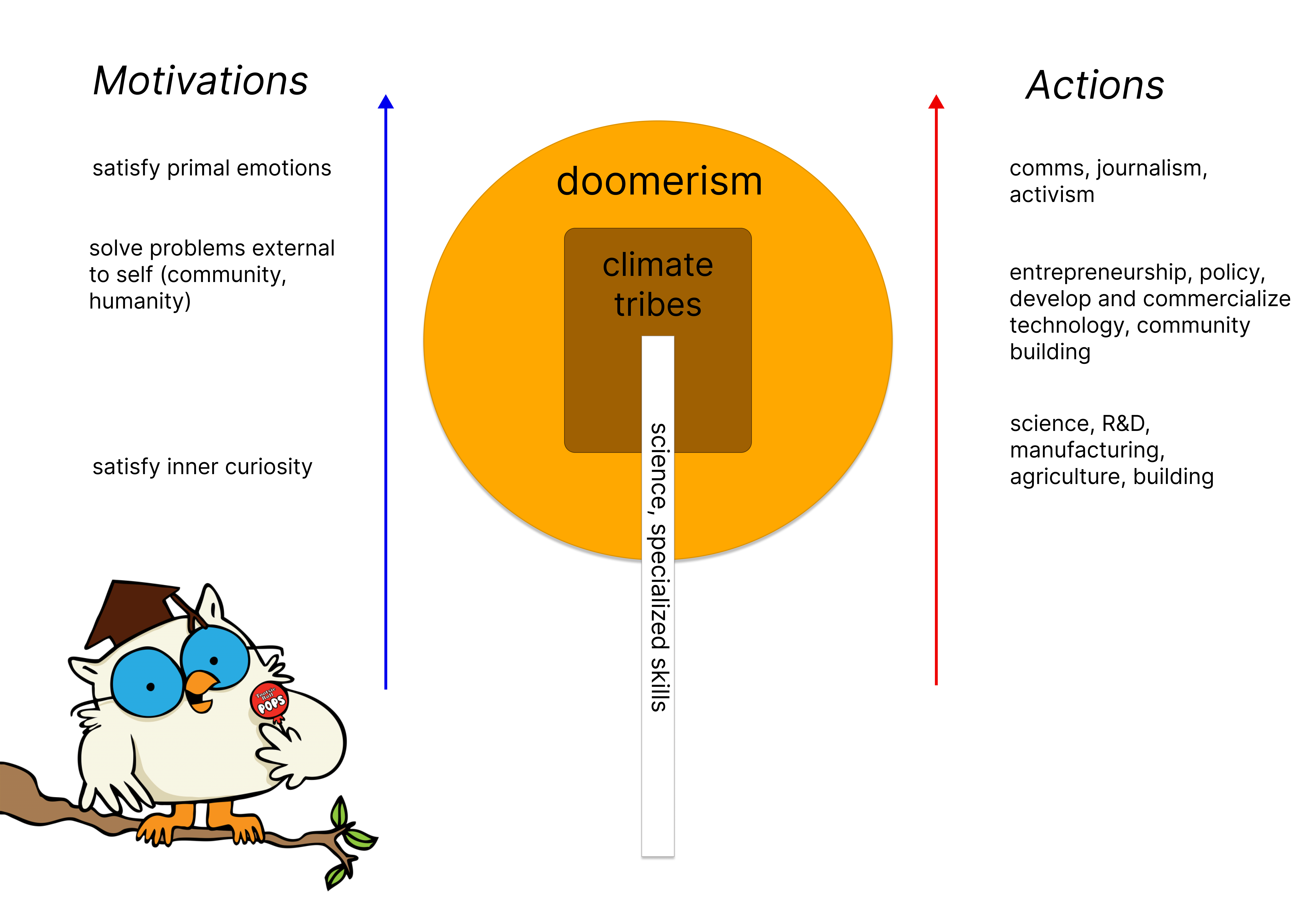
But the more interesting thing I stumbled upon was realizing that the climate discourse has changed a lot from the early 2000s. Even though people still talk about climate deniers, I think we’ve implicitly moved from being divided on “Is climate change real, or not” to these more actionable, tribal divisions around the right solutions to pursue.
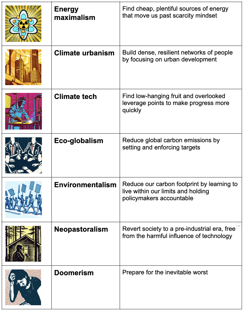
I decided to make that the focus of my map, and develop language to identify what all the different climate tribes were, some of which don’t even use the term “climate” or try to distance themselves from it, but are still part of that conversation anyway:
“See” the space
Once I have a goal, I start trying to “see” or traverse the space, using that echolocation I talked about.
I think this happens interchangeably with the first step. You start with a question, and then you look at the space a bit, and then that helps you refine your question, and you iterate your way towards a framework.
It’s kinda hard for me to describe how “seeing” a space works, but a lot of it is paying attention to what’s happening between the lines, and where the boundaries are. You might look for conflicts between two groups, and then you say, “Okay, what type of language are they using? What’s different about their goals? Where do they disagree?”
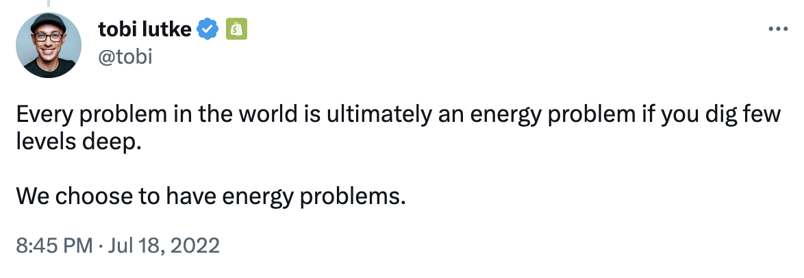
One example that I looked at with climate are what I called the energy maximalists, and they stand out because they don’t really talk about climate change, but they do like to talk about “energy.” For example:
 Via Twitter.
Then you ask yourself, well, why do they use that term, and it’s because they don’t want to talk about the scarcity of environmental resources. They want to focus on abundance, like how do we create more energy. So that already gives me some motivations and key vocabulary to start recording.
You can use that to go deeper into the group and say, “Who do they keep referencing? Which blog posts do they cite? Where do they gather online?”
Record your landmarks
As I go through that process, I start recording key landmarks that I notice along the way. Landmarks, just like rivers or mountains, can be people, organizations, keywords, canonical reading, events, where they gather online, things like that.
Just sticking with the climate examples for a bit, I noticed at least there was some cluster of people who would reference Michael Shellenberger’s book Apocalypse Never, or the Breakthrough Institute, or the Eco-Modernist manifesto. Those are some examples of landmarks I used to “draw” a picture of that tribe and their territory. The idea being that if someone had a collection of all these items, they too might be able to “see” the same space that I see.
Add detail
At this point, I have a general schematic of the space, and that’s when I go in and start trying to add detail: stress-testing my theories, and making sure that my assumptions hold. This is the equivalent of adding fine lines or shading in a drawing.
Some of this work I can do on my own. I’ll do things like go through and read people’s Twitter feeds, or blogs, with my “picture” of the space in my mind, and see if anything breaks the model. If so, then I go back and refine my model to reflect those changes.
But I think it’s also kinda necessary to just talk to as many people as you can, or just find ways to be around the activities they’re doing in their natural environment, so you can observe what’s going on.
Draw the map
Finally, there’s the actual drawing or visualizing of the map in a way that makes it understandable to your audience.
Writing out my process for this talk has made me realize that I’m pretty bad at visualizations. I’m a text-heavy person. I’m very into the “back-end” part of map work, like actually figuring out what does the territory even look like, but I’m less into the “front-end” part of it – meaning, how to communicate it effectively to my desired audience.
So I don’t know that I have great advice here – or rather, whatever my advice is, you probably shouldn’t listen to me, because I just like text-based everything. I was proud of myself with the climate tribes piece, though, because I used DALL-E to generate images for each tribe, which was actually really helpful. So I guess if you’re very text-centric like I am, this is one way to get out of your comfort zone.
I also remembered at the last minute before publishing to put all the images and tribes and descriptions into a little table, which I think was helpful for people to see it all in one place, instead of in one long blog post, and it made it more shareable as a summary. So that was one way to visualize it.
Let’s look at some maps!
That’s my process for mapmaking. As our last activity, I thought it’d be fun to look at some different examples of digital maps, and try to unpack the methodologies they used. There’s no order to these examples, I just collected a few that I thought were interesting for different reasons. Shoutout to Rival Voices for publishing a collection of maps on his Substack, that was very helpful for me.
Skeumorphic maps
To start with the obvious, I’ll show a few examples of what I call “skeumorphic” maps, which use physical territories as a literal metaphor for digital ones.
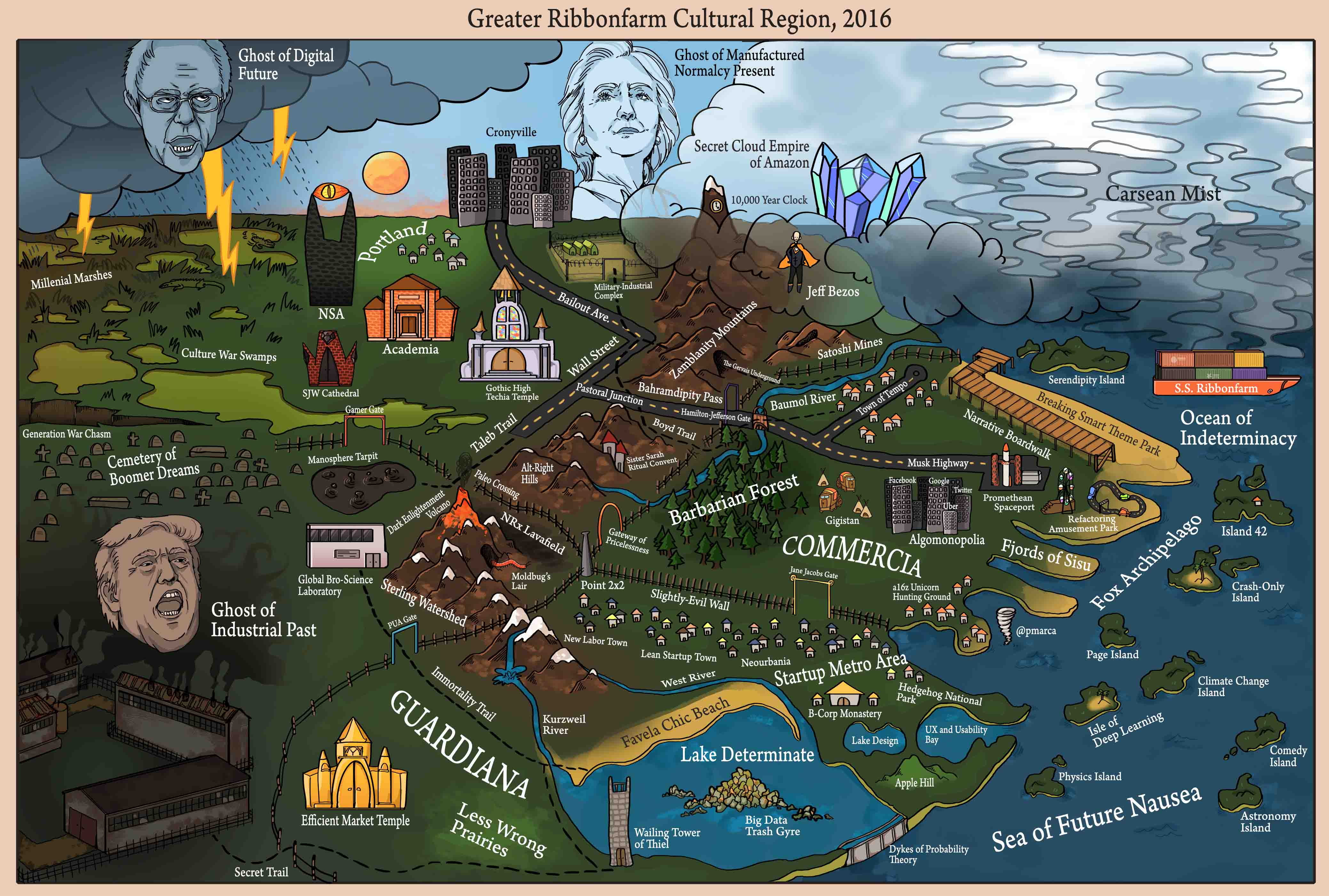 Via Ribbonfarm.
This Ribbonfarm one is a classic that’s stuck in my mind over the years, and you can see how different geographic landmarks, like mist or islands, or giant crystals, are used to convey something about the character of each community.
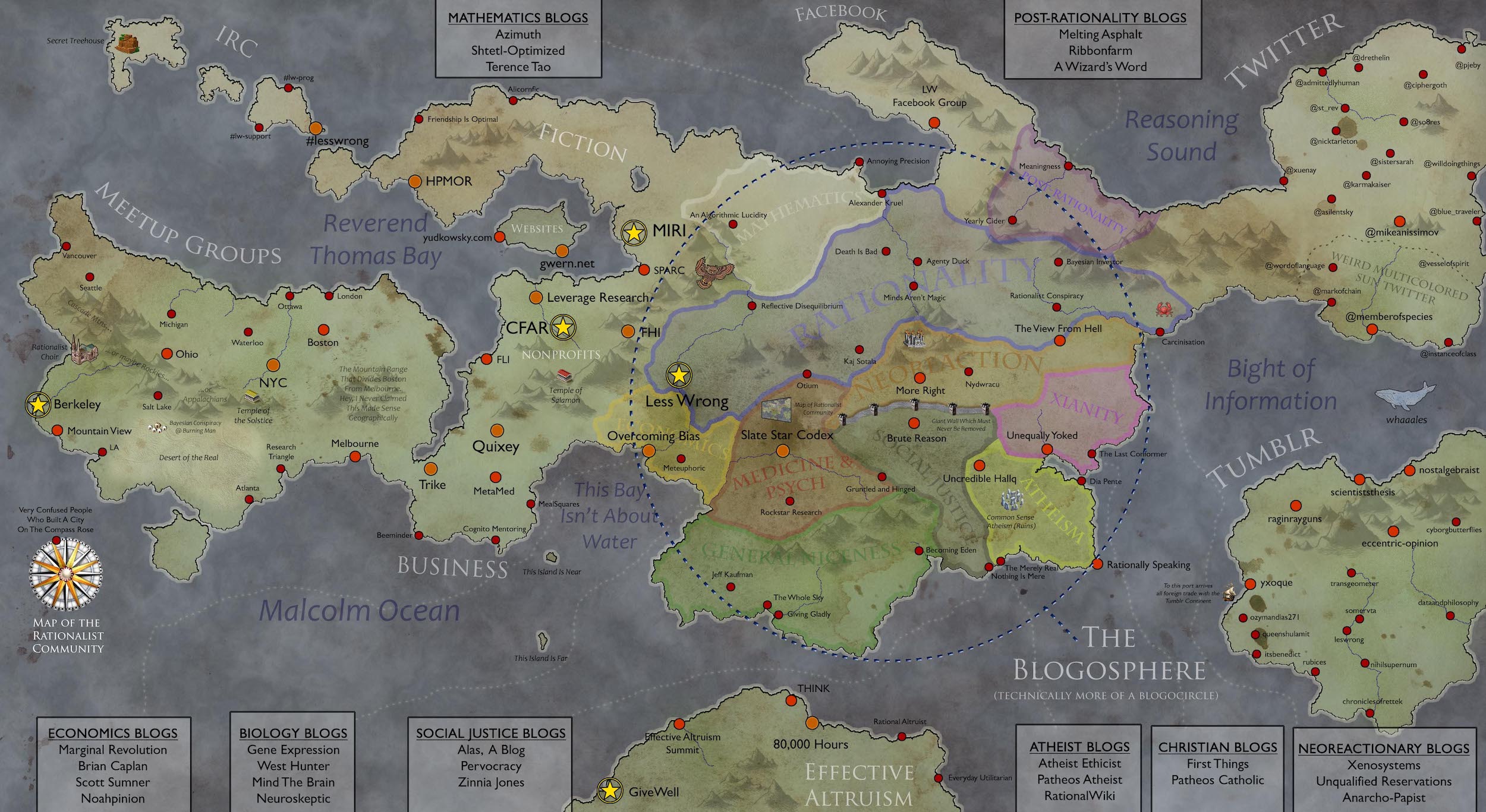 Via Slate Star Codex.
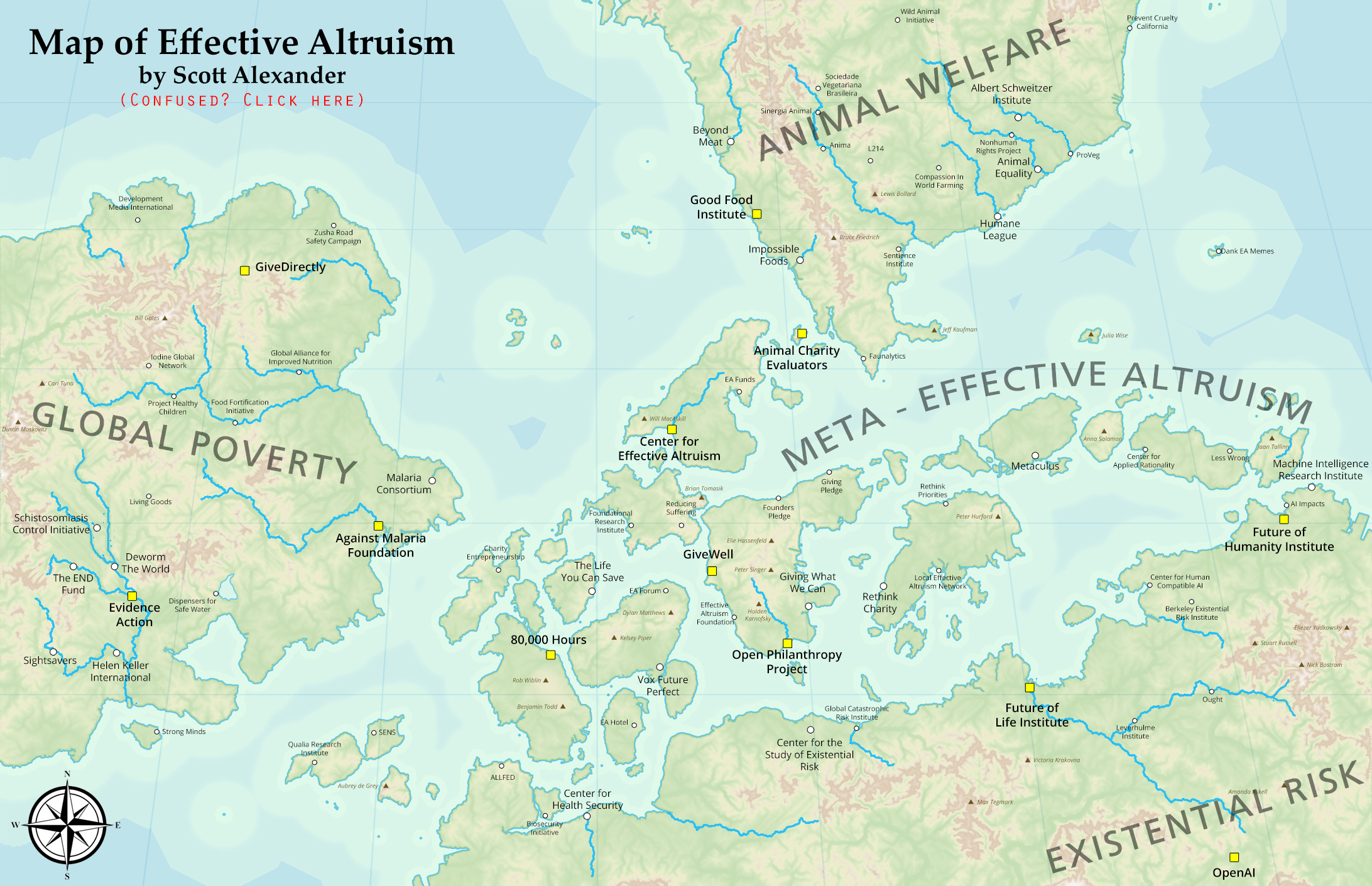 Via Slate Star Codex.
Scott Alexander has also made a map for effective altruism, as well as for the rationalist and rationalist-adjacent blogosphere, using this skeumorphic approach.
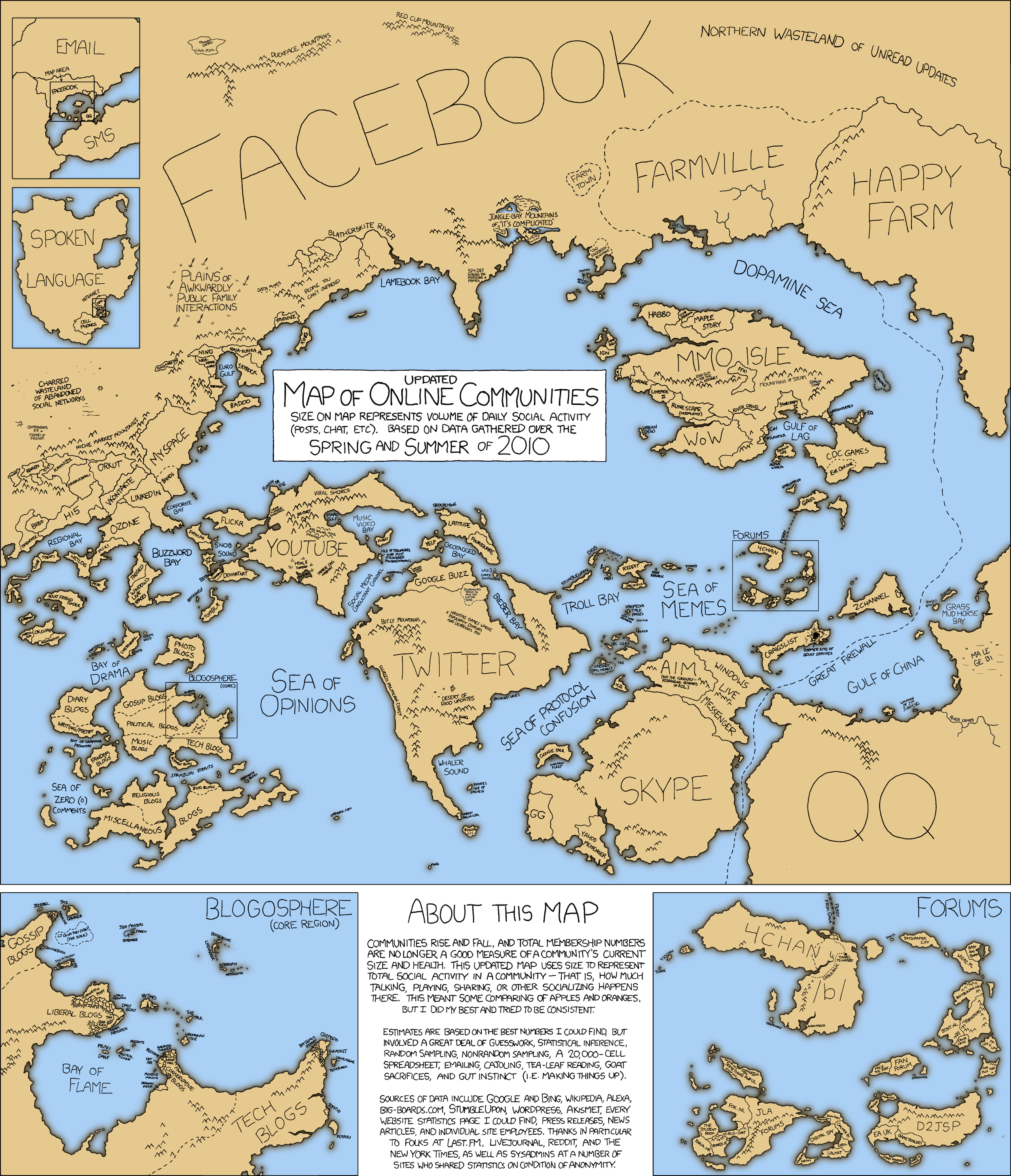 Via xkcd.
This one is from xkcd. It’s a “map of online communities” in 2010, back when the world of online communities was small enough to fit on a map.
These skeumorphic maps can be useful, because they borrow from an existing framework that readers already understand. For example, in the xkcd map, Facebook is enormous in terms of its influence, but also kinda isolated as this behemoth, whereas YouTube and Twitter, just below it, are comparatively smaller, but are more like biodiverse islands that give way to other little communities.
But skeumorphic maps can also be limited, in that, we can see a picture of the entire, broad landscape here, but it’s a very shallow set of information. I would call this a relational map – it tells us how these different territories compare to each other, but doesn’t tell us a whole lot about any one specific community.
The other issue is that accessing the digital world isn’t the same as the physical world. Going back to that need for echolocation or proprioception, I think we need to rely more on those senses to make our way around digital worlds. A physical map doesn’t really tell me how to find the interesting stuff on YouTube or Facebook or whatever, beyond going to the literal websites of course. I have very few landmarks here to help me generate a picture of any one community. These maps are always fun to look at, but I think digital-native maps actually look quite different.
“Type of Guy” maps
 Doomers
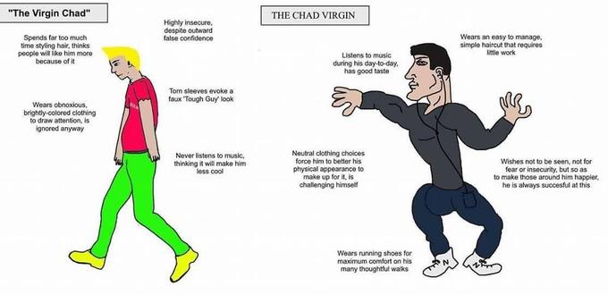 Virgins vs. chads
These are on the other end of the information scale, and they feel much more digital-native. I call these “type of guy” maps. You might say they’re more like memes than maps, because they don’t necessarily look like what we think of as a map, but they actually contain a lot of condensed information that helps us generate a picture of a digital world more quickly.
These maps tell you how to conjure an image of a certain type of person, or community, in your mind, based on landmarks that might have otherwise been invisible to you. They are less useful at conveying relational information as the skeumorphic maps – the virgin-chad meme, for example, would break if we added too many more personas – but they are good for helping you find your way to at least one or two places.
Schematic maps
Staying with the more detailed or thematic map examples, schematic maps are also more about depth over breadth. They’re also more opinionated and explicit about the underlying framework being used, versus the other two types we looked at.
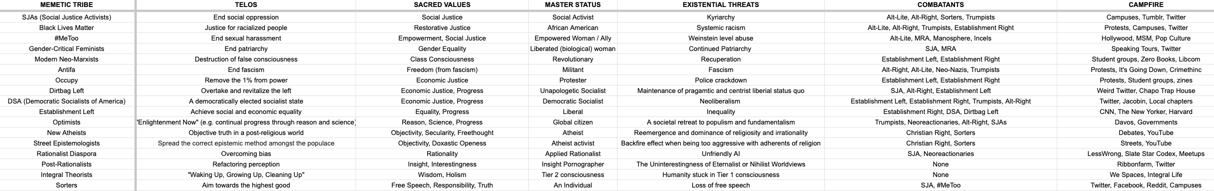
We’ve got Peter and Conor’s memetic tribes 2.0 above, which gives each memetic tribe a set of characteristics - sacred values, existential threats, campfires - which is a term I love for “gathering places.”
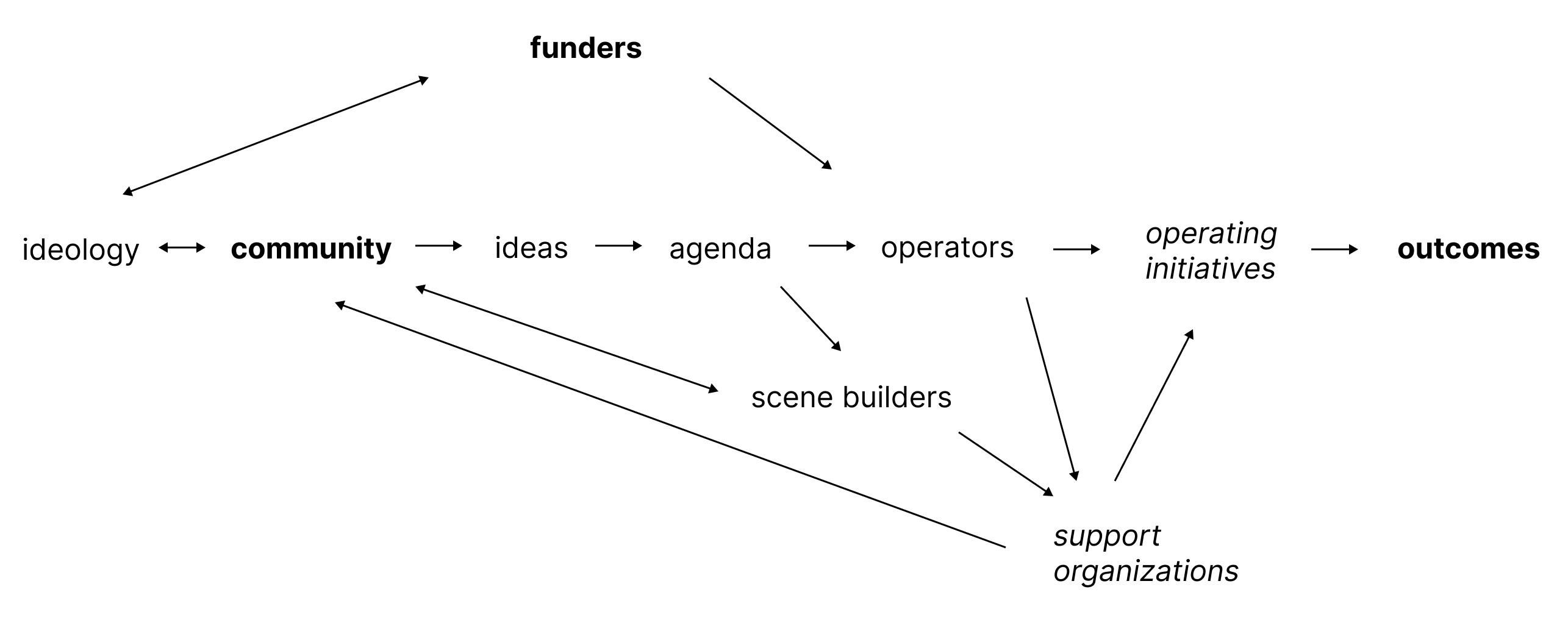
Below that is a diagram I made for a post I wrote last year about what I called “idea machines,” or these amorphous organisms, like effective altruism or progress studies, that can turn ideas into outcomes. In both cases here, the concept of a “mimetic tribe,” or the concept of an “idea machine,” is just as important about these maps as what’s actually being mapped inside it.
“Chinese menu” maps
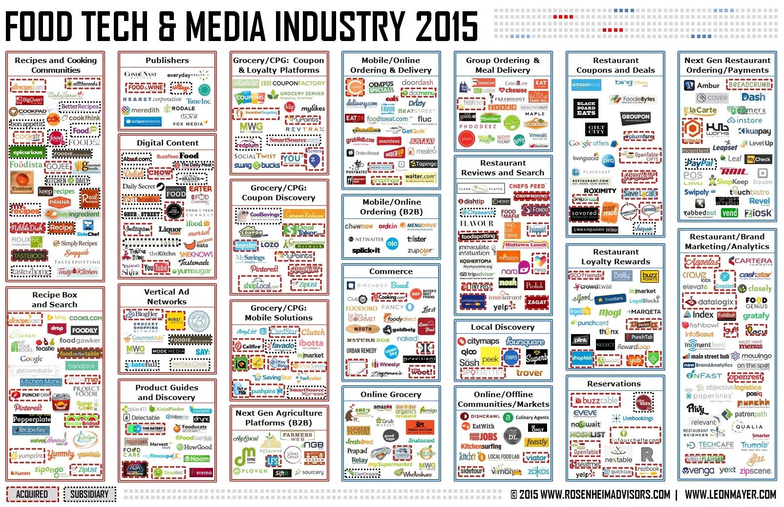 via Food+Tech Connect.
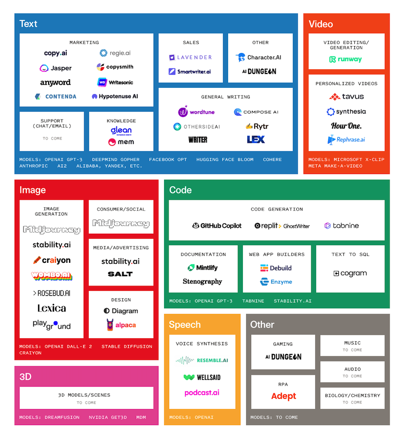 via Sequoia (source).
I personally love schematic maps, because as I’ve said, I’m very text-heavy, and it’s kinda all the visual I need. But on the more visual side, this “Chinese menu”-style map is a very popular landscape mapping technique, but I think it’s a deceptive one. It doesn’t really help you find your way around a space, because it generally only uses one type of landmark, like companies or organizations, and groups them into themes.
To me, this is kinda like handing someone a list of every river in the United States – just rivers, nothing else – and asking someone to draw a map of America based on that. I think you just need more than one type of landmark to paint that picture. So I don’t find this type of map to be particularly actionable. Perhaps it’s more like an infographic than a map, but it is very popular.
Matrix maps
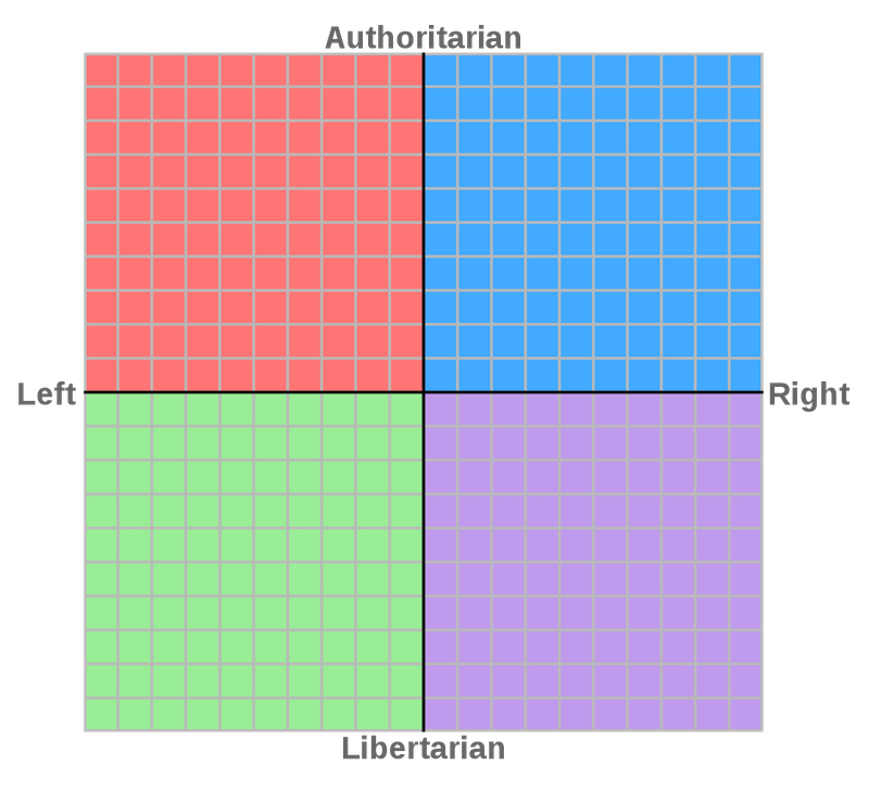 Political compass
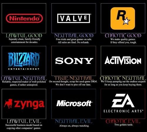 Alignment map
A more information-rich way of showing a digital landscape is the matrix map, which is also very popular, and gives the reader more relational context. Above, I have the political compass, as well as an example of “alignment” charts, which map certain landscapes based on a good-evil and lawful-chaotic framework. It still only gives you one type of landmark, such as political parties, or game companies in the examples here, but it at least “draws” the space by putting those landmarks into a more contextual landscape.
World cloud maps
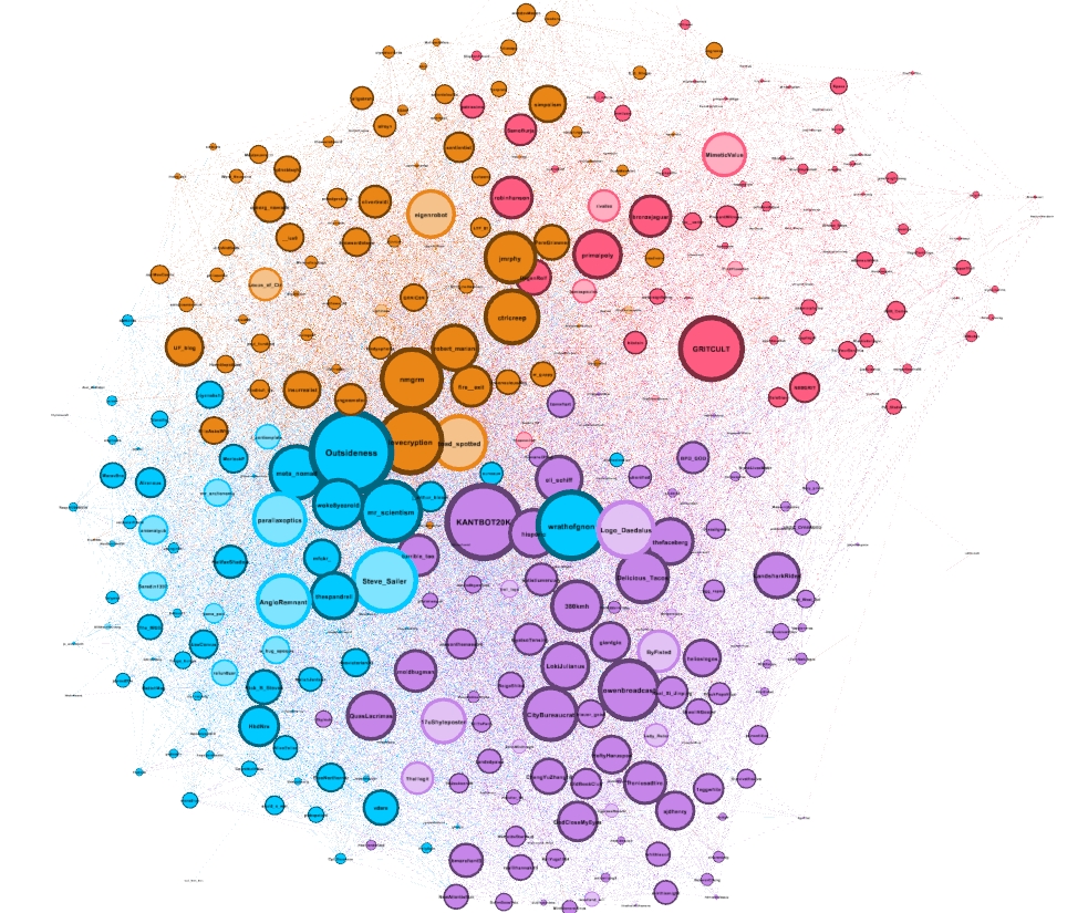 via Twitter.
This is the last type of map I’ll show, just to bring our analogy back to the physical world again.
The mapping methodology I described earlier, which I use, is kinda like me drawing maps by hand. It’s like I went and surveyed the land with my own eyes and then figured out how to draw all that out. This type of map, on the other hand, is more algorithmically generated. It’s like using satellite imagery to generate a map – very Google Maps-esque. I call it the “word cloud” technique.
This example is from a set of maps that someone published a few years ago, where they clustered different groups of people on Twitter together based on their public interactions, and used that to visualize all these digital spaces. They labeled the blue circles as “accelerationism and esoteric philosophy”, orange as “weird rationalists?,” and purple as “4channish, ironic humor.” And then they didn’t know what pink was.
If what I do is more like “echolocation” of flooding my brain with a ton of input and seeing what emerges in my mind, I think this approach is more like a typically “scientific” approach, which can probably uncover connections that we might not be aware of otherwise, and also just helps remove the doubt of “Am I training my brain on the wrong inputs,” or “Am I stuck in the wrong corner of the web,” because you can see it all.
On the other hand, I think this techique highlights what is so difficult about mapping digital versus physical territories, because digital spaces are so subjective and hard to discern just with cold hard data.
For example, there are plenty of people who talk to each other a lot in DMs or group chats, but don’t interact much in public, and you wouldn’t know that if you were just looking at public data. There are prominent people in certain communities who aren’t on Twitter, but have very active blogs or newsletters.
So I think there’s still a lot of tacit knowledge that’s hard to capture with this approach. It’d be cool to see some of these mapping tools developed as the “satellite imagery” equivalent for digital maps, but I also think their usefulness is more limited in the digital world. But that might just be my bias.
Maps create power (good and bad)
I hope this gave you some ideas about both why digital maps are useful, why we should take this practice more seriously, and how you might go about creating your own. I’d love to see more maps of digital worlds, so if you make any, please send them to me!
To wrap up, I think a lot of people want to think of digital territories as these idyllic tribes, like a safe space or escape from the real world. But even the short history of online communities thus far suggests that they are evolving and changing. We can’t be stuck in the ’90s forever. The 2010 xkcd map of online communities, for example, paints a very different world from the map we’d draw today. Things are changing.
So if we view the history of digital worlds as linear or progressive or on a forward trajectory in any way, rather than a static state, I think mapmaking could help us take our digital worlds more seriously, and even legitimize them.
Balaji Srinivasan published a book last year called The Network State, which basically introduces his idea of what comes after the nation state. While nation states are defined by geographic borders and physical territories, network states are a digital-first version that start out as online communities, but can eventually acquire land and diplomatic power, which would make them as powerful as nation states.
Maybe digital spaces are still in this ephemeral, nomadic tribe state because we artificially keep them there by refusing to map them. Opening these spaces up to the outside world can make them into targets, but it also creates new pathways for transactions to flow between worlds, and that can make the digital world more powerful.
If we want to take our digital worlds more seriously, part of that starts with finding ways to legitimize them, instead of leaving them undefined. And in the physical world, at least, the way that started was with mapmaking.